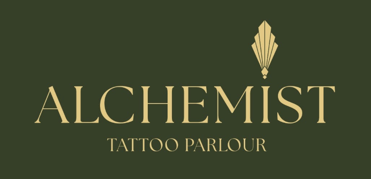


Visual reference inspected 17 September 2026. Hex values are visual approximations.

Design system · 17 September 2026

Tattoos by Richard

Deep olive, antique gold and parchment, composed around the work itself. The tattoos command attention; the interface around them stays calm and personal.

Cormorant Garamond display, 500 and 600
Inter body and interface, 400 to 600

  • Olive
  • Parchment
  • Photography
  • Gold
An illustrative balance, not a measured rule: olive, parchment and photography carry the page, and gold marks a few points of emphasis.

Overview

An adaptation of the supplied design system for the visual identity shown on Richard’s Facebook page, inspected on 17 September 2026.

The identity centres on deep olive green, antique gold, fine ornamental borders and elegant serif lettering. The profile logo combines an olive field, a gold geometric fan motif and a delicate double-line frame. The cover foregrounds close-up tattoo photography with prominent black-and-grey work.

Translate those characteristics into an intimate, carefully composed tattoo portfolio: olive hero sections, gold accents, parchment reading surfaces, generous photography and restrained Art Deco detailing.

Key characteristics

  • Matte olive green as the primary brand colour, with deeper olive for footer and contrasting panels.
  • Antique gold for accents, fine rules and primary actions on dark backgrounds.
  • Elegant serif display typography paired with a quiet, readable sans-serif.
  • Mostly square photography and subtly rounded controls; fine frames instead of pill-heavy styling.
  • Real tattoo photography with faithful colour, texture and detail.
  • Portfolio browsing and a clear invitation to enquire about a consultation.

Evidence and interpretation. Olive, gold, serif lettering, ornamental geometry and tattoo photography are observed. The hex values below are visual approximations for implementation, not sampled official brand specifications. Supporting colours, font choices, spacing and component rules are proposed extensions of that identity.

Facebook’s navigation, blue buttons and dark-mode interface are platform styling, not part of the artist’s brand.

Colours

Olive is the primary brand colour and gold is the supporting accent. Portfolio categories share one neutral treatment rather than introducing unrelated accent colours. Select any swatch to copy its hex value.

Brand & accent

Surface

Decorative hairlines are not substitutes for clearly visible form boundaries or focus indicators.

Text

Semantic & interaction

Semantic colours communicate state only. Use a written label or icon alongside colour.

Validated text pairings

Approximate contrast ratios calculated from the proposed solid sRGB values. Use these pairs at full opacity.

Parchment / primary oliveEnquire about a tattoo9.52:1
Antique gold / primary oliveEnquire about a tattoo6.07:1
Ink / antique goldEnquire about a tattoo9.01:1
Ink / pressed goldEnquire about a tattoo6.53:1
Ink / parchmentEnquire about a tattoo14.13:1
Secondary ink / parchmentEnquire about a tattoo5.29:1
Muted light text / deep oliveEnquire about a tattoo9.77:1
Gold is unsuitable for small text on parchmentUse olive instead. Text over photography needs an opaque backing or an individually checked overlay.

Typography

Serif headlines establish the character. The sans-serif handles readable details and practical actions.

Font families

Display · proposed

Cormorant Garamond

Elegant serif forms echo the logo’s lettering without claiming to reproduce the original typeface. Use weights 500 and 600.

Fallbacks: Georgia, 'Times New Roman', serif

Body & interface · proposed

Inter

The quiet, readable face for body copy, labels, navigation and buttons. Use weights 400, 500 and 600.

Fallbacks: -apple-system, BlinkMacSystemFont, 'Segoe UI', sans-serif

Preserve the supplied logo as artwork when an approved original is available. Do not typeset a replacement logo with either font. Monospace has no customer-facing role in this system.

Hierarchy

Each sample is set in its own token. The hero size follows the breakpoint table, so it appears smaller on narrow screens.

Principles

  • Let serif headlines establish the character; use the sans-serif for readable details and practical actions.
  • Use sentence case for most headings. Reserve widely tracked capitals for short labels and small ornamental lockups.
  • Keep prose to approximately 60–68 characters per line.
  • Avoid distressed lettering, decorative script for body text and heavy display effects.
  • Suggested hero copy: “All ideas welcome.” Supporting copy may invite people to discuss a tattoo with Richard. Keep availability, pricing and outcomes factual.

Layout

A 4px base unit, with most layout increments in steps of 8px, inside a 1280px maximum container.

Spacing system

{spacing.xxs}4px
{spacing.xs}8px
{spacing.sm}12px
{spacing.md}16px
{spacing.lg}24px
{spacing.xl}32px
{spacing.xxl}48px
{spacing.section}64px
{spacing.section-lg}96px
{spacing.hero}120px

Grid & container

Desktop hero: two columns, with approximately 45% for text and 55% for a strong tattoo photograph.
Portfolio: three columns desktop, two tablet and one mobile, with 24px gaps.
  • Maximum content width: 1280px.
  • Horizontal page gutters: 32px desktop, 24px tablet, 20px mobile.
  • Artist introduction and consultation sections: two columns desktop, one below 768px.
Suggested page sequence
  1. Hero
  2. Selected work
  3. Artist introduction
  4. Consultation
  5. FAQ
  6. Contact footer

Publish only sections with real content.

Whitespace philosophy

Allow 96px between major desktop sections and 56px on mobile. Hero padding is 120px desktop, 80px tablet and 64px mobile. Keep image grids tighter than introductory sections. Leave space around gold ornament so the detail remains deliberate.

Elevation & depth

Mostly flat. Shadow is reserved for things that genuinely float.

0
FlatNo shadow; optional 1px hairlinePortfolio, ordinary cards and section dividers
1
Subtle0 2px 8px rgba(32,35,27,0.06)Small floating controls
2
Panel0 8px 24px rgba(32,35,27,0.10)Featured consultation panel
3
Overlay0 16px 48px rgba(0,0,0,0.24)Image viewer or dialog

Decorative depth

Use tonal olive panels, 1px gold rules and an occasional double-line frame. Keep gold flat rather than metallic, glowing or strongly bevelled. Ornament belongs around a hero title or one featured panel, not every card. Avoid grain over text or photographs.

Shapes

The primary button shape is a gently softened rectangle. Photography and ornamental frames stay square.

Border radius scale

{rounded.none}0Photography and ornamental frames
{rounded.xs}2pxSmall category labels
{rounded.sm}4pxButtons, filters and standard cards
{rounded.md}6pxInputs and small panels
{rounded.lg}8pxConsultation cards and dialogs
{rounded.full}9999pxCircular portrait or icon control only

Double-line frames may use a 4–6px inset; they remain decorative and must not resemble additional interactive boundaries.

Photography geometry

4:5
Portfolio thumbnails and desktop hero.
4:3
Hero photograph on mobile, when the composition allows it.
16:9
Wide studio imagery, where appropriate.
  • Use consistent crops within a row of thumbnails.
  • Detail view: uncropped, original aspect ratio with object-fit: contain.
  • Preserve the tattoo’s edges, placement and significant detail. If a fixed crop cuts through the work, use a different image or preserve its natural ratio.
  • Keep natural skin tones and the original ink colour. A black-and-grey tattoo is not a reason to desaturate the whole photograph.

Components

Default, selected, pressed, disabled and keyboard-focus states are specified below. Essential information and actions remain visible without hover. Crossed boxes stand in for real tattoo photography, and placeholder copy is marked as such.

Buttons

Olive leads on parchment; gold leads on olive. Every variant shares one size and one gently softened corner.

  • Typography {typography.button-md}, padding 12px 24px, minimum height 48px, radius 4px.
  • Focus: 2px outline, offset 3px, in the focus colour for the surface. Never remove the browser outline without this replacement.
  • Disabled: disabled tokens, native disabled behaviour, no active styling.
  • Borders keep the same width across states to prevent movement.
  • Ghost and icon-only controls need a visible label or an accessible name, with a 44 × 44px minimum target.
  • Text links keep their underline in all states.
On parchment
button-primary
Default
Pressed
Keyboard focus
Disabled
button-secondary
Default
Pressed
Keyboard focus
Disabled
button-link
On olive
button-on-dark
Default
Pressed
Keyboard focus
Disabled
button-secondary-on-dark
Default
Pressed
Keyboard focus
button-ghost · button-link
See selected work

Cards & containers

Portfolio cards are image-led, flat and mostly frameless. Supporting cards stay quiet so the work leads.

  • card-portfolio A 4:5 thumbnail above a 14px caption. Use real work titles or concise descriptions, never invented project names. The image link opens the full piece; write useful alt text.
  • card-base Light surface, 4px radius, 32px padding, decorative hairline.
  • card-artist Real portrait, display heading, short introduction. 48px padding desktop, 24px mobile. Verified experience and studio details only.
  • card-consultation 8px radius, one clear enquiry action. A thin gold frame may emphasise the dark version.
  • card-testimonial Only a real, sourced review. Never manufacture a quote, rating or client identity.
card-portfolio · grid
Tattoo photograph
Placeholder caption: a concise description of the real piece.
Tattoo photograph
Placeholder caption: placement and style.
Tattoo photograph
Placeholder caption: a real work title.
card-base

Before your consultation

Placeholder: practical supporting content, written from Richard’s actual process.

card-testimonial
“Placeholder quotation. Replace with a real, sourced review before publishing.”
Attribution and source to be supplied
card-artist
Real portrait

About Richard

Placeholder introduction. Include only verified experience and studio details.

card-consultation

Talk through your idea

All ideas welcome. Get in touch to discuss a tattoo with Richard.

card-consultation · dark

Talk through your idea

All ideas welcome. Get in touch to discuss a tattoo with Richard.

Inputs & forms

Persistent labels sit above fields. The proposed enquiry form asks for a name, a reply email, the tattoo idea and an optional placement or approximate size.

  • text-input text-area Light surface, ink text, 1px strong hairline, 6px radius, 12px 16px padding.
  • Inputs at least 48px high; textarea at least 144px. Editable text at least 16px.
  • Focus uses the shared outline without changing the field’s dimensions.
  • Error: semantic error boundary plus a specific message below the field, connected programmatically, with the input marked invalid.
  • Show success only after a real submission succeeds, without inventing a response-time promise.
  • If no form service exists, direct the action to a verified contact route rather than showing a false success.
Enquiry form · email shown in its error state

Enter a full email address to reply to, such as name@example.com.

Tabs & filters

portfolio-filter A wrapping row of text buttons. Try them: the selected state is carried by fill, weight, a tick and a programmatic pressed state, not by colour alone.

  • 4px corners, minimum 44px targets.
  • Inactive: transparent fill and secondary ink.
  • Selected on light: olive fill, parchment text. Selected on dark: gold fill, ink text.
  • Start with “All work”. Add categories only when the actual portfolio supports them. The other labels here are examples.
  • Wrap across lines rather than scrolling sideways. No rainbow category badges.
On parchment
On olive

Badges & status

Labels state facts. Status messages pair colour with a written status and an icon.

  • badge-neutral Soft olive fill, olive text, 13px semibold, 2px radius, 4px 8px padding. For factual portfolio labels.
  • badge-on-dark Transparent fill, gold text, fine gold border. For short, verified supporting labels.
  • status-message Semantic background with matching text, 16px padding.
  • Never use “Available”, “Booking open” or similar claims unless current availability has been confirmed.
Black and greyForearmExample labels
Enquiry sentThanks. Richard will reply to the email address you gave. (Example wording, shown only after a real submission succeeds.)
Check before you sendAdd a short description of your idea so Richard has something to respond to.
Enquiry not sentEnter a full email address to reply to, then send again.
Free consultationExample only. Recheck the offer before using it.

Portfolio detail

portfolio-viewer An ink-dark stage for the uncropped photograph, with an optional caption and a clearly labelled close button.

  • Keyboard operable: Escape closes, focus stays inside while open, and focus returns to the thumbnail afterwards.
  • Visible previous and next controls. Swipe may supplement them; it must not be the only navigation.
  • Original aspect ratio with object-fit: contain. The demo cycles 4:5, 1:1 and 16:9 frames to show nothing is cropped.
  • Overlay elevation, level 3.
Live demo

Practical information

details-list A semantic description list for verified contact details or consultation information.

  • Stack label and value on narrow screens.
  • Quiet divider lines, comfortably spaced text.
  • Do not turn tattoo services into subscription tiers, or invent fixed prices, deposits or consultation terms. Add a price list only when real pricing is supplied.
Artist
Richard
Consultation
The page biography mentions a free consultation. Recheck the offer before promoting it.
Studio name
To be confirmed. See Known gaps.
Address and hours
To be supplied and verified.

FAQ

faq-accordion-item Flat parchment surface, bottom hairline, 24px vertical padding and an 18px sans-serif question.

  • Native disclosure, or an accessible button with expanded state.
  • Question target at least 44px high.
  • Answers must reflect the artist’s actual process. Aftercare guidance uses the studio’s approved wording.
How do I enquire about a tattoo?

Placeholder answer. Describe Richard’s actual enquiry route once the contact method is verified.

What happens at a consultation?

Placeholder answer. To be written from Richard’s actual process.

How should I look after a new tattoo?

Placeholder answer. Use the studio’s approved aftercare wording.

Navigation

top-navigation Olive background, parchment links and a gold enquiry action. Minimum height 80px desktop and 64px mobile, with room for text growth. Below 1024px it collapses to a labelled menu with an accessible expanded state. Keep the number of links small, and make sure any sticky navigation leaves keyboard-focused content and anchored headings visible.

Use the approved logo with preserved proportions when available. The dashed slot marks where the artwork goes; do not typeset a replacement.

Signature components

The pieces that make the site recognisably Richard’s: an olive hero, one gold double-line frame, a deep-olive call to enquire and a compact footer.

hero-band-olive

Tattoos by Richard

All ideas welcome.

Bring a sketch, a reference or just a thought, and talk it through with Richard.

One prominent tattoo photograph

Primary olive field, parchment serif headline, gold eyebrow or fine rule, short supporting text, gold CTA and one prominent photograph. Production uses 120px vertical padding on desktop; the specimen is shown tighter. Keep the text on an opaque field so the artwork stays unaltered. Below 1024px the photograph follows the copy.

deco-frame
Selected work

A decorative gold double-line border, used once per major composition. Let the existing logo carry the fan motif; do not create a competing emblem. Reduce the inset on mobile.

cta-banner-dark

Have an idea? Talk it through.

Deep olive panel, concise display heading, gold enquiry button. 64px padding desktop, 32px mobile. Keep the invitation personal and factual.

footer-region

Deep olive background, parchment headings, muted light body text and gold underlined links. Three compact columns for identity, navigation and verified contact information; stacked on mobile.

Do’s and don’ts

Do

  • Use olive as the defining brand colour and gold as the restrained accent.
  • Pair serif display headings with readable sans-serif body copy.
  • Keep photography honest and give the actual tattoo work generous space.
  • Use fine borders, subtle corners and occasional Art Deco framing.
  • Keep consultation and contact actions easy to find and accurately labelled.
  • Use the approved logo unchanged and check its readability at small sizes.
  • Preserve strong contrast, visible focus and adequate touch targets.

Don’t

  • Carry forward the neon-green, deep-teal, code-terminal or product-pricing motifs of the supplied software example.
  • Treat Facebook blue or its interface background as the artist’s brand palette.
  • Use gold for small text on light backgrounds.
  • Apply pill shapes to every button or heavy shadows to portfolio images.
  • Add generic tattoo clichés, distressed textures or competing decorative symbols.
  • Apply colour casts, smoothing or contrast effects that misrepresent the tattoo.
  • Invent services, specialisms, awards, client reviews, availability or commercial terms.

Responsive behaviour

Section headings reduce from 36px on desktop to 30px on mobile. Body copy remains 16px or larger. Let headings wrap naturally and test long labels without reducing their readability.

Breakpoints

NameWidthHero typeLayout
Mobile smallBelow 480px40pxOne-column hero and portfolio; 20px gutters
Mobile large480–767px48pxOne-column hero and portfolio; 20px gutters
Tablet768–1023px56pxStacked hero; two-column portfolio; 24px gutters
Desktop1024–1279px64pxSplit hero; three-column portfolio; 32px gutters
Wide desktop1280px and above72pxFull composition inside 1280px maximum container

Touch targets

  • Primary and secondary buttons: minimum height 48px.
  • Form inputs: minimum height 48px.
  • Navigation, filters, disclosure triggers and icon controls: minimum 44px effective target.
  • Adjacent controls: at least 8px gap where practical.

Image behaviour

Use responsive image sizes and preserve aspect ratios to avoid layout shift. Lazy-load below-the-fold portfolio imagery. Choose focal points manually when cropping thumbnails; the full work remains available in the detail view.

Avoid autoplay video and parallax. Optional state transitions use 150–200ms ease; respect reduced-motion preferences.

Collapsing strategy

  • Below 1024px, collapse navigation to a labelled menu with accessible expanded state.
  • Below 1024px, place hero photography after the headline, supporting text and CTA in reading order.
  • Portfolio follows the exact column counts in the breakpoint table.
  • Below 768px, stack artist, consultation and footer content.
  • Stack CTA buttons when they no longer fit; permit full-width actions on narrow screens.
  • Wrap filters across lines rather than hiding options behind horizontal overflow.
  • Reduce ornamental frame insets on mobile and remove optional flourishes before compressing content.

Iteration guide

The order to work in when extending or implementing the system.

  1. Work on one named component at a time and use the defined tokens.
  2. Check the result on both parchment and olive wherever the component supports both contexts.
  3. Keep the primary brand olive and the supporting gold consistent with the profile reference.
  4. Review the artwork before selecting crops or adding portfolio categories.
  5. Validate text contrast, keyboard focus, error states and touch targets in the actual implementation.
  6. Check narrow mobile layouts, 200% text zoom, and whether long labels wrap without clipping.
  7. Add any new token’s concrete value before referencing it elsewhere in this document.
  8. Use the project’s real validation tools when an implementation exists. This document does not assume the software-specific linter named in the supplied example is installed.

Known gaps

Open questions to resolve before this system becomes a live site.

Needs a decision or real content

  • The Facebook page title currently reads “Pinstripe tattoo parlour”, while the profile artwork reads “Alchemist Tattoo Parlour”. This document uses “Tattoos by Richard” as a descriptive working label from the request and page biography. Resolve the intended public studio name before creating or replacing a wordmark.
  • No original brand artwork, official colour specifications or font metadata were supplied. The palette is visually matched and the type pairing is proposed.
  • The page biography mentions free consultation. Recheck that offer before using it in a live promotion; do not infer appointment availability from it.
  • Final image selection, portfolio categories, biographical copy and studio policies remain content inputs rather than invented examples.
  • Contact details and commercial information should be checked when implementing a live site; no booking integration or form delivery is specified here.
Piece 1 of 3
Uncropped · 4:5

Placeholder caption. The photograph keeps its original aspect ratio.